 | |
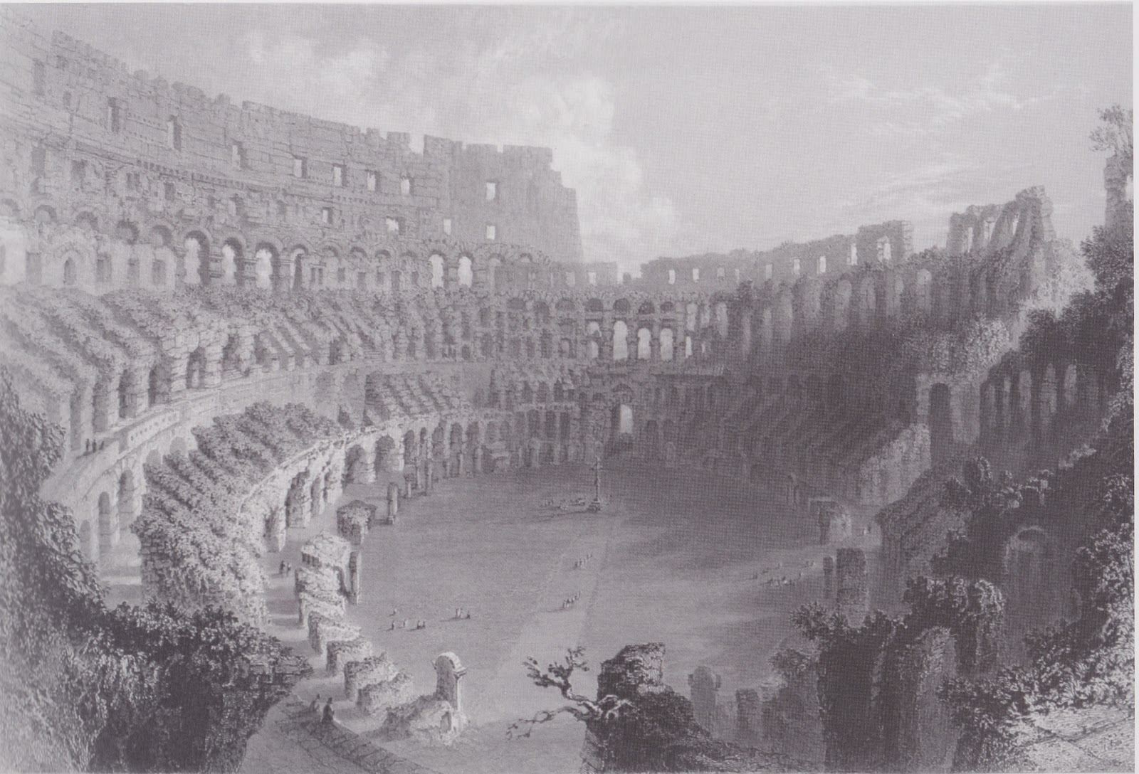
| "The Coliseum at Roma" c. 1850. Drawn by W.H. Bartlett. Engraved by E. Challis. Steel Engraved Print. |
GENERAL INTRODUCTION OF DRAWING
The drawing is a steel engraved print titled The Coliseum at Roma. It was drawn by W.H. Bartlett and engraved by E. Challis circa 1850. The drawing of the ruins of the Coliseum serves as an accurate portrayal of the site located in Rome, Italy. Below is a brief history of the Coliseum, as I think it is important to know the background of the structure in order to better understand the drawing.
The construction of the Coliseum (also spelled Colosseum) took about nine years to complete (from 71 AD - 80 AD). It was built under the reign of Emperors Vespasian, Titus, and Domitian as a gift to the Roman citizens. It is considered one of the greatest architectural achievements of the ancient Romans. This vast amphitheater could hold 50,000 spectators and was used to host gladiatorial battles as well as other public spectacles, such as dramas and staged animal hunts. (Information from www.colosseum.net).
DETAILED DESCRIPTION OF DRAWING
A collection of bold and distinct lines does not seem to exist in this drawing. The lines in this piece are very subtle because the majority of the lines seem to be created from the use of different tones. The tones vary across the gradient. There are very dark areas and very light areas, but they are relatively few. Thus, there are a lot of gray tones that are very similar in value. Bartlett's technique creates a very smooth drawing with a sense of unity due to lots of subtle details created by the different tones, which are quite similar in gradient, combined to make the picture whole. Texture is an extremely important aspect of this drawing. Bartlett's use of tones allows the viewer to imagine what it must feel like to touch the stones used to build the Coliseum. The texture he shows also lets the viewer know that this piece of architecture is ancient. There seems to be lots of cracks and rough spots on the stones, a result of age and weather damage. In addition, he uses tone in the same way to create a very vivid idea of what the texture of the leaves on the trees must be. However, his use of texture in the trees does not give the trees a very peaceful feel because it is the only part of the drawing where there is a lot of contrast between really light places and really dark places. I will come back to that observation later when I discuss my interpretation of the drawing.
The form depicted in this drawing is one of an immensely important historical structure. I think it is safe to say that most people in the world who have learned about the history of western civilization know of the Coliseum in Rome. Thus the form of the Coliseum carries with it an important significance. The artist's use of composition in this drawing allows the Coliseum to dominate almost the entire drawing. It is the central aspect with few others - just trees and the cloudy sky. He also omitted a strong horizon line, a feature of drawing that tends to draw attention. I think the fact that Bartlett drew the form of the Coliseum to take up almost the entire drawing refers to the historical significance of this piece of architecture to the western world. The shape of the amphitheater, as depicted by Bartlett, shows that it has not survived in perfect condition. While he depicts the very circular aspect of the Coliseum on the left side, he also shows the ruin and decay that interrupts that roundness by drawing the uneven walls and the invasion of the trees on the right side.
I would not say that rhythm is a part of this piece. Each aspect is filled with intricate detail varying from the texture of the stone to the leaves of the trees to the subtlety of the shading in the clouds, thus I think it would be hard to set up a rhythm when drawing this piece because there is so much variety in the details.
I do not believe that this drawing is balanced and it is rather asymmetrical in regards to tone and shape. The right side of the drawing is much darker than the left. There are places of light that create a stark contrast on the right side side, especially in the front right hand bottom corner, just as there are places on the left that are darker. However, in general, the right side is darker, the shapes of the walls of the Coliseum are shorter, and the continuous shape of the Coliseum is broken by ruin and trees. The left side is much brighter, taller, and the shape is more continuous.
As I mentioned before, the use of shading and tones, as well as the difference in the sizes of the columns and arches, creates the illusion of depth in the piece and gives the drawing a very 3-dimensional feel to it. The viewer can differentiate the foreground from the background due to the perspective used by the artist because the proportions of the objects in the foreground are larger than in the background. An example that shows the depth of the drawing would be the arches in the Coliseum. They are narrower with more shadows near the foreground and as they move into the background, they get wider and one can start seeing the sky through them. The artist seems to be looking down on the Coliseum because the objects on the ground level in the center of the Coliseum are smaller. The drawing has a one point perspective with a focal point on the area where the walls of the Coliseum change drastically in height as well as where the majority of the drawing goes from light to dark.
The drawing is very harmonious, mainly due to the circular aspect of the Coliseum itself. The viewer's eye is drawn around the entire picture because of the roundness of the structure. The perspective and depth created by the tones and the shapes of the structure also contribute to this harmony. Half the picture is lighter than the other half. However, there is still harmony because the darker half has areas of light and is the side where the light source is coming from, while the light half has some darker areas (in the trees). So the two areas of light and dark do not throw off the harmony of the drawing because they each of areas of light and dark within them.
As I mentioned above, the tones in this drawing vary subtlety across the value scale. However, in general, the right side is significantly darker than the left side. This contrast is not enormous because if one starts looking on the left side and works his or her eyes to the other side, the tone gradually changes to much darker. One can also see that light source is obviously coming from the right side because of a very bright area shining through the dark areas to make the opposite side of the Coliseum very bright. The strongest contrasts are in the trees mostly on the right side.
INTERPRETATION AND EVALUATION OF DRAWING
This drawing evokes many different ideas in my mind on how to interpret it. Ultimately the phrase I would use to describe the mood of the drawing would be a "sense of defeat." I think that this feeling of defeat can come from many different aspects of the drawing.The first one I thought of is more of a side idea, not the central thought. If one looks at the drawing, one can see what looks like a Christian cross. For those who do not know, Ancient Rome was a pagan society until about 313 AD when Constantine I signed the Edict of Milan. Before 313, Christians were persecuted and many of them were forced into gladiator fights and fed to wild animals in the Coliseum. The cross symbolizes defeat because it shows Christianity's defeat of the pagan religion that was so significant in Roman culture. The Coliseum was built as a secular building for the public's entertainment. However, just as it did all over Europe, Christianity managed dominate. The Christians who died in the Coliseum were made martyrs and eventually the Coliseum became a Christian site in the 17th and 18th centuries. Thus, I think that the cross in the center of this historically significant structure shows the defeat of Roman paganism and the victory of Christianity.
Another obvious way to see "defeat" in this drawing is just to think about the primary use of the Coliseum when it was built. A place to fight, to slaughter, to defeat other human beings or animals. Human life was ephemeral in this amphitheater. People died all the time. In the drawing, there are small figures of humans. They are barely noticeable. The vastness of the structure of the amphitheater overpowers the human figures. It seems to me that this could represent the ephemerality, the fleetingness, the shortness of human life in contrast with the long-lasting history, especially of significant buildings.
Which brings me to my next point, the defeat of the importance of history and heritage to contemporary society. Although this drawing was made over a century ago, it is still relevant today. The Coliseum is in the same or even worse state of disrepair as it was when Bartlett drew it. The ruins of the Coliseum depicted in the drawing shows the world's neglect of our history. This is a global problem. Many other very prominent historical sites are being neglected and forgotten. History is slowly being defeated. This drawing is just one example of how important sites are being neglected by people and reclaimed by nature.
My last point in regards to the "sense of defeat" in this drawing pertains to a point I mentioned when describing the tone and textures of the trees. Compared to the rest of the drawing, there is stronger contrast between light and dark areas in the trees. The trees are also in the foreground. The strong contrasts and the positioning of the trees make them very important to the drawing. I think that the trees in contrast with the structure of the amphitheater shows a kind of cyclical defeat - an ongoing battle between civilization and nature. When the Coliseum was first built, obviously land had to be cleared in order to make such an enormous structure. Stones needed to be quarried and forests destroyed. Nature was defeated by civilization. But, as the Coliseum was neglected and no longer used, nature started to reclaim its territory. This is evident in the drawing. The trees look very foreboding because of the sharp contrasts in them compared to the soft gray tones in the rest of the drawing. Also, the darker right side of the drawing has more trees, which adds to this sense of foreboding and danger. The trees seem to be creeping in to take over the area where the Coliseum is. The people in the drawing are mainly on the left, brighter side. They are the symbols of civilization, while on the right side it is darker and the Coliseum is in a stronger state of disrepair with trees among the stones. Nature is slowly defeating civilization.
I think that this drawing is most interesting because of its accuracy and detail in depicting the Coliseum, as well as the many different interpretations one can have in regards to it. To me, the adjective that bests describes this work would be foreboding. Usually darkness represents evil and savagery while brightness represents good and refinement. The dark shadows creeping in from the right side of the drawing create a sense of foreboding savagery moving into the piece, while the lighter left hand side shows the unaware bystander about to be caught up into the shadows. The dark and gnarled forms of the trees on the right side seem to be reaching toward the left side about to tug it into the darkness of its takeover. It is possible to interpret this drawing in the opposite way and suggest that the lightness is overtaking the darkness. However, when considering the history behind this drawing, I think that is unlikely because the Coliseum (at that time) was in ruins and nature was slowly dominating the man-made structure. Thus, this drawing has a sense of foreboding because the shadows on the right side and outstretched limbs of the dark trees imply that the left side will soon succumb to its fate of being overtaken by nature.

Hello, I am Joyce Ma, I think the gradation of tone in this drawing is very good, because we can see the dark are and the light area with not any boundary line, and black colour in this drawing is quite soft.
ReplyDeleteHi Joyce. This is Sarah. I completely agree with what you are saying about the lack of boundary lines between the dark and the light area because of the gradation of tones. The lack of strong contrasts does give the drawing a very soft feel and makes it almost look completely gray at first glance. However, on closer inspection, there are lots of different subtle tones.
ReplyDeleteThis is Stacie!
ReplyDeleteI agree that the drawing reflects the sad truth about the defeated history. Since the world is changing so fast, many historical and cultural sites are demolished and reconstruced into new sites. It's sad that the historical memories are forgotten and neglected. Some people just don't care about the past.
Hi, I am Log.
ReplyDeleteThis drawing attracting me so much. Because I know what the artist drawing and from his angel can see the momentum and spacious.
its new discovery
ReplyDeletecolosseum rome i have picture new discovery
ReplyDelete